Follow These 5 Color Schemes to Make Your Room Look Bigger
Decorating small spaces can be difficult. Aside from the obvious issue of having to plan the best layout for your room and triple-measure furniture for size, paint color can have a significant effect on how big or small space looks and feels—and this decision extends beyond basic color choices.
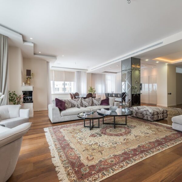
Lovely touches of decor such as a personalized name sign, and light furnishings such as candles and vases can completely transform a room. Despite these additions, your space can still feel cramped and claustrophobic. To mediate it, use various paint colors to make space appear bigger and more spacious.
Color has the uncanny ability to transform any room, and with the right palette, you can set the perfect tone for your space. Here are several color schemes that will make a small room seem larger.

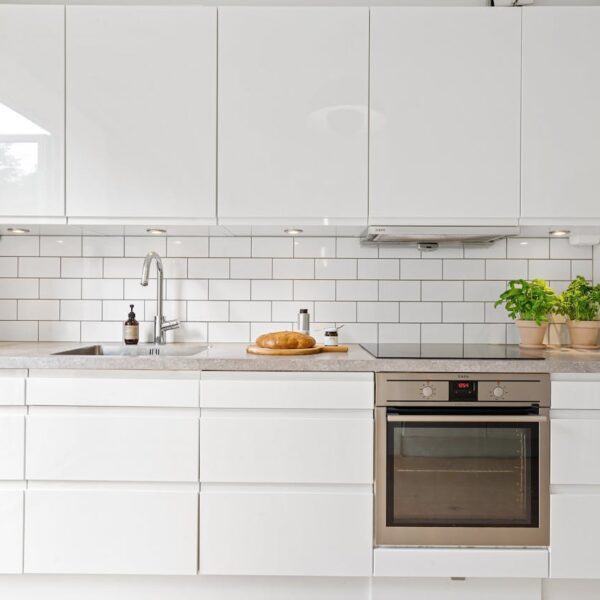
Stark White
White is, of course, an easy option for making a space appear larger. It’s no secret that light colors make a room look bigger, particularly when lit by natural light. Satin or eggshell finishes can help to reflect light, giving the illusion of more space.
It also works regardless of your aesthetic or the kind of space you have. White is a great palette to begin your décor process, whether it’s a deco living room, a modern kitchen, or a country-inspired bedroom.
Use this color in rooms with a southern orientation.
Light Taupe
If you don’t want to go fully white but still want a neutral paint color for your room, a greige or light taupe will make it feel more spacious and elegant. It is still bright enough to allow light to bounce from one wall to the next, but it has a touch of warmth that a true bright white does not.
This rich tone has the power to make a room appear costly, so use it in a space with little architectural details to give it stature. When using this color, keep the rest of the room’s furnishings white to keep the space feel light and airy.
This color scheme can be used in rooms with no architectural details.
Dark Navy
In rooms with little natural light, a deep navy hue can add dimension and make a space feel stately and dramatic. If you want a black room’s comfortable and romantic feel but aren’t ready to go completely black, navy is a good option.
When painting your walls in the dark navy shade, keep bulky furniture like sofas in the same hue to blur the lines between the room’s edges and make it look bigger. It also makes it an excellent choice for rooms with cabinetry, such as kitchens and libraries. A word of advice? Whatever color you’re working with, monochromatic styling works well.
This color is best for kitchens and libraries where there isn’t much natural light.
Blush Pink
A soft blush pink will brighten up a small space and make it feel cheery and light—it also looks great at sunset. This color looks best in a room with plenty of natural light and pairs well with light, warm neutrals like sand, beige, and ivory. For a more enveloping effect, paint the ceiling the same color as the walls.
Don’t let pink deceive you into thinking it’s the ultimate feminine color (though it can!). The pale blush also works well with modern metals, masculine woods, and luxurious leather or velvet furniture.
This color can be used in rooms with western orientation.
Cool Gray
A light cool gray paint color is a perfect alternative to white paint color because it can feel new and vibrant without being too stark. Cool colors are more refreshing and vibrant than warm colors, and they help to create the illusion of more space visually. Use this color in a room with moderate lighting to build a cozy yet spacious atmosphere.
Instead of the warmth that a taupe can offer, a light grey offers the clarity and crispness of a bright white, allowing light to bounce off the walls while still keeping the room cool.
Use this color in a room that faces east or west.